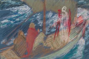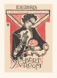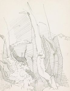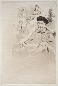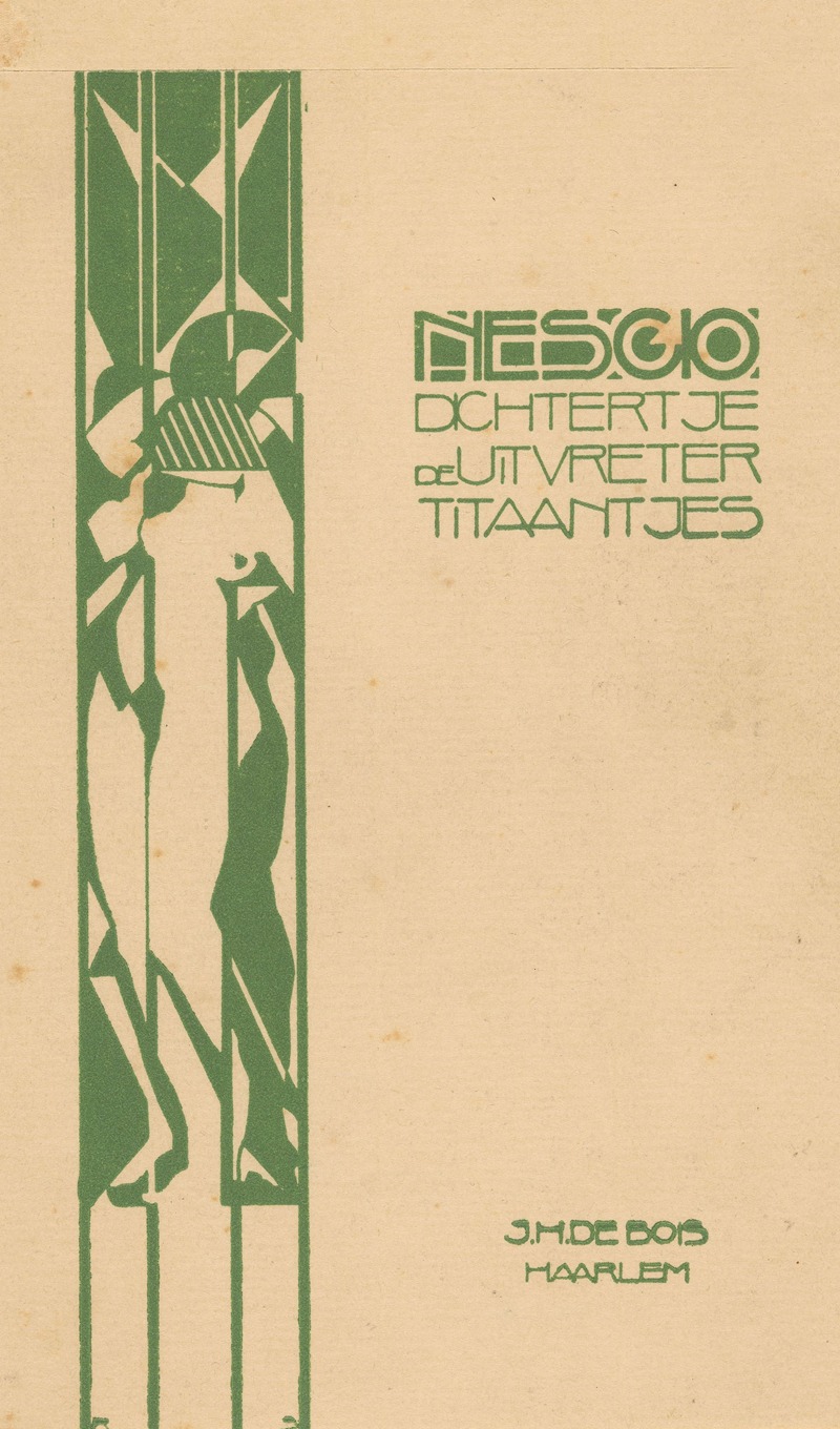
Ontwerp voor boekband voor Nescio’s `Dichtertje, de Uitvreter en Titaantjes’
A hand-painted replica of Reijer Stolk’s masterpiece Ontwerp voor boekband voor Nescio’s `Dichtertje, de Uitvreter en Titaantjes’, meticulously crafted by professional artists to capture the true essence of the original. Each piece is created with museum-quality canvas and rare mineral pigments, carefully painted by experienced artists with delicate brushstrokes and rich, layered colors to perfectly recreate the texture of the original artwork. Unlike machine-printed reproductions, this hand-painted version brings the painting to life, infused with the artist’s emotions and skill in every stroke. Whether for personal collection or home decoration, it instantly elevates the artistic atmosphere of any space.
Reijer Stolk's design for the book cover of Nescio's "Dichtertje, de Uitvreter en Titaantjes" is a notable example of early 20th-century Dutch book art. Reijer Stolk, a Dutch artist and graphic designer, was known for his contributions to book design during a period when the art form was gaining recognition as an integral part of literary presentation.
Nescio, the pen name of Jan Hendrik Frederik Grönloh, was a Dutch writer renowned for his short stories that captured the existential musings and struggles of young artists and intellectuals in the Netherlands. His works, including "Dichtertje" (Little Poet), "De Uitvreter" (The Freeloader), and "Titaantjes" (Little Titans), are considered classics of Dutch literature. These stories explore themes of idealism, disillusionment, and the search for meaning, resonating with readers through their poignant and introspective narratives.
The collaboration between Nescio and Reijer Stolk for the book cover design reflects a harmonious blend of literary and visual art. Stolk's design is characterized by its simplicity and elegance, capturing the essence of Nescio's stories. The cover art likely employs minimalist elements, a common trait in Stolk's work, which often focused on clean lines and subtle details to convey deeper meanings. This approach aligns with the introspective and understated nature of Nescio's writing.
During the early 20th century, book cover design was undergoing a transformation, with artists like Stolk playing a crucial role in elevating it to an art form. The period saw a shift from purely functional covers to those that were considered an extension of the literary work itself. Designers began to experiment with typography, imagery, and layout to create covers that not only protected the book but also provided a visual entry point into the narrative.
Stolk's contribution to the cover of Nescio’s collection would have been part of this broader movement within the arts, where the visual presentation of a book became an important aspect of its identity and appeal. His work likely complemented the themes of Nescio's stories, using visual motifs to echo the existential and philosophical questions posed by the text.
While specific details about the design elements Stolk used for this particular cover are not extensively documented, his overall style suggests a thoughtful integration of form and content. His designs often employed a restrained color palette and geometric forms, which could have been used to reflect the modernist sensibilities of the time.
In summary, Reijer Stolk's design for the cover of Nescio's "Dichtertje, de Uitvreter en Titaantjes" represents a significant intersection of literary and visual art in early 20th-century Dutch culture. It exemplifies the era's evolving approach to book design, where the cover became an essential component of the reader's experience, offering a visual prelude to the literary journey within.